Site Redesign
Posted on Saturday, 02 May 2020
3 minutes to read
Introduction
Hi! So I made this blog about 2 months ago and I think now it doesn't have a decent UI/UX at least in my opinion. Now, because I have plenty of free time because of the current pandemic that's been going on for a couple of months. I decided to redesign it and I'll explain why.
Components Redesign
Navigation Bar
I changed the background to be a little bit transparent so that I can use a backdrop-filter that I recently discovered. It looks really cool, like looking through a white glass.
I added the social media icon to the navbar unlike previously where I put it on the footer so people can could easily see them. The icons are also changed, they have their original shape instead of having a circular background.
Footer
Nothing much changed here except I made it to be more 'informative' I guess. I also removed the previous social media icon which I've already mentioned.
Pages Redesign
Home page
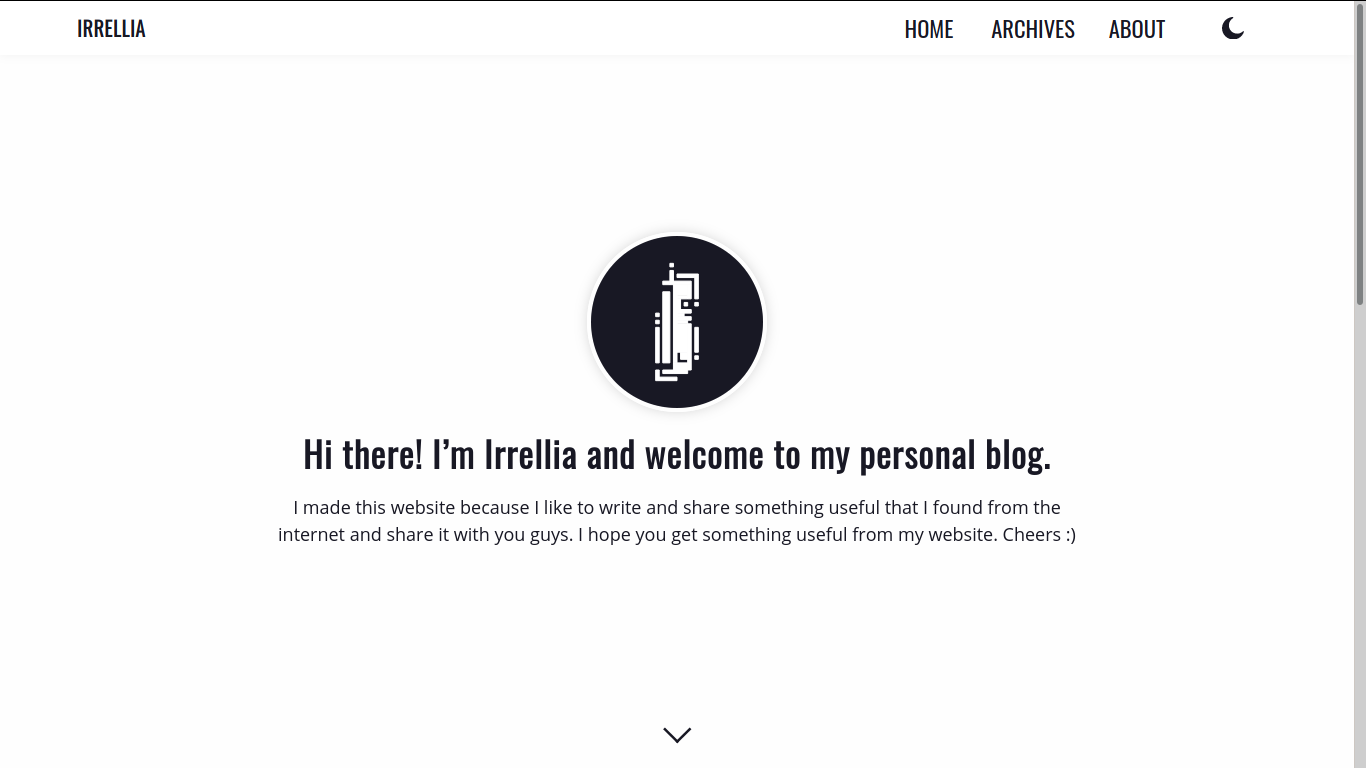
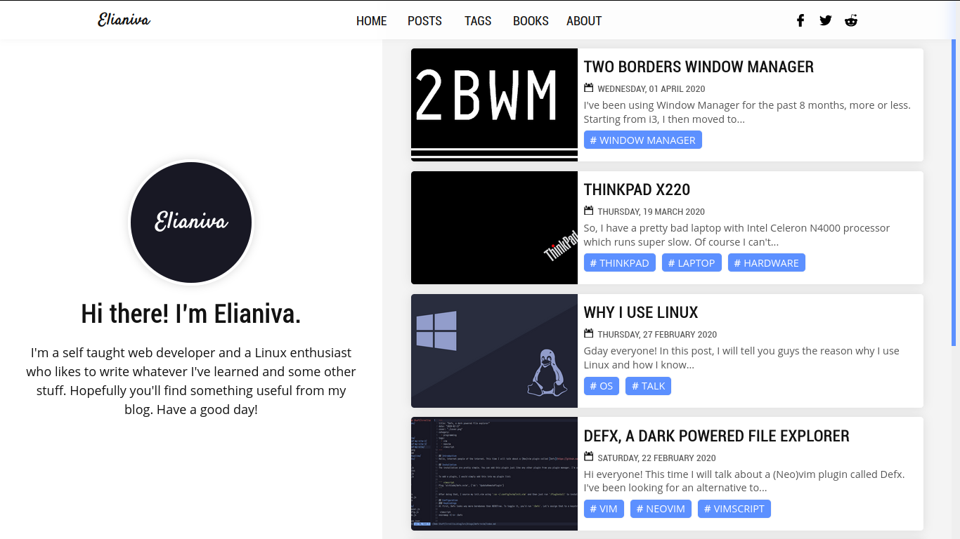
Previously, I have this one big section that fills the entire screen with a logo and a quick description about me. That's not very good in terms of the UX. I decided to make it look more compact by dividing it into 2 sides. Here's the comparison.


I also don't have a new logo for my username yet. So it is what it is. I'll make that in the future.
(06092020) UPDATE: I decided to use my github profile picture instead.
Tags page
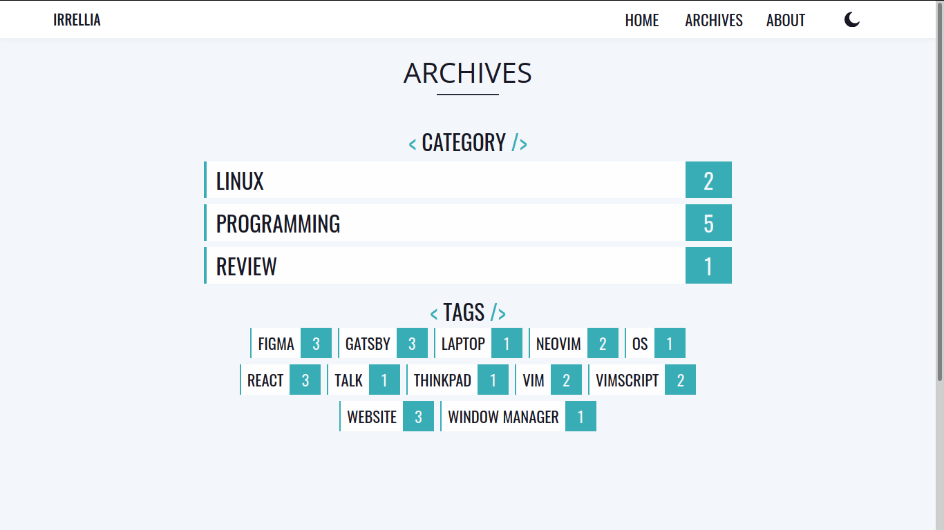
I decided to remove the category. I think tags will be enough because I have another plan for the "category" thingy. I'll talk about that later on. If you've seen my archives page before, it kinda look like a mess, like seriously. I mean just look at this.

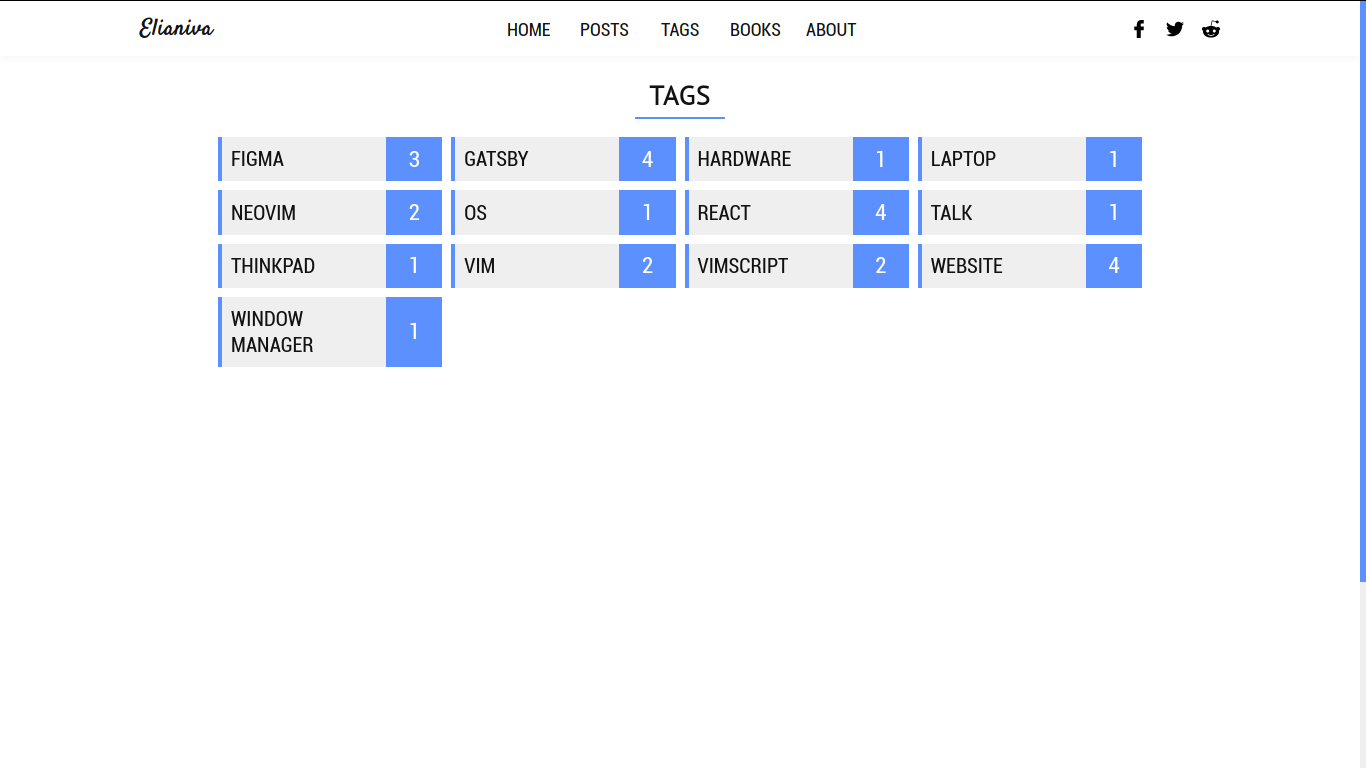
and compare that to this.

The new page looks way better than the old one. At least in my opinion.
Post page
I changed the post page slightly. The code block use dark theme even if the site is light theme. I try to give some contrast so the reader can focus on what they read. Other than that, nothing's changed.
Post list page
I still use the same pagination page from previous website and I just changed the navigation button a little bit. That's all.
About page
Previously, I made the about page as sort of a QnA page. I replace it with an explanation about myself instead this time. Go check it yourself ;)
Books page
I am planning on making this page to be a place where I put some sort of series. I got this idea from Bandithijo. Check him out by the way, his content is just pure awesomeness.
So currently, it is a work in progress. "coming soon", that's all you got for now.
Other stuff
I fixed some little bugs that's previously happened and what not. Just some tiny little improvements.
Conclusion
All in all, I really like the end result. Let me now what you think down below in the new disqus comment section ;)
gatsbyreactwebsite